Can you hear it too? It clicks and clatters in the World Wide Web. One pocket watch after the other is being snapped shut, money cases are being stowed away in safe places, they are no longer needed. Because cunning operators of online platforms no longer need to resort to hypnosis artists or vast sums of money to entice their users into unwanted actions. All it takes is the ingenuity of savvy web designers to use small design tricks to mislead customers. These design tricks are called dark patterns and are a real problem in today's digital space. In this blog post, you'll learn what constitutes dark patterns, what regulations are in place to protect consumers from them, and how to avoid them.
Wait a minute, who are you?
Dark patterns are used on online interfaces of platforms and serve to manipulate users. Online interfaces are the point of contact between the operator/provider and the visitors of a website and appear, among other things, in the form of a cookie banner. Dark patterns aim to limit people's ability to make a free and informed choice or decision. As a result, users are forced to behave on online platforms in a way that may not be in their interest and may have unintended consequences for them. These unintended consequences are often related to the unwanted sharing of personal data.
The European Data Protection Board also addressed the issue last year and published guidelines on the subject. The purpose of the guidelines is to help designers and users of social media platforms to recognize and prevent dark patterns on their interfaces. For this purpose, the EDPB has defined six different categories:
Overloading
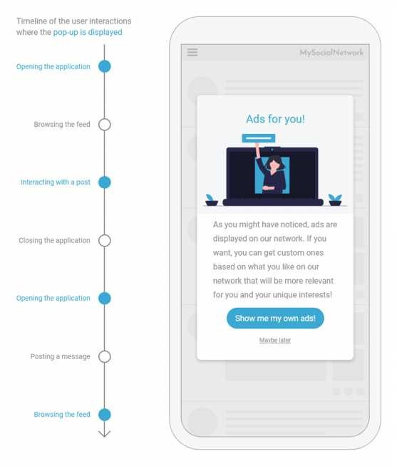
Users are confronted with a large number of requests, information and options. This is intended to overwhelm them and make them accept the respective type of data processing as quickly as possible, since anything further would be too complicated. Concrete "overloading practices" include repeatedly asking for consent, complicating the search for information, or presenting too many choices in an unclear manner.

Source: Guidelines 3/2022 on Dark patterns in social media platform interfaces: How to recognise and avoid them, p. 38
Skipping
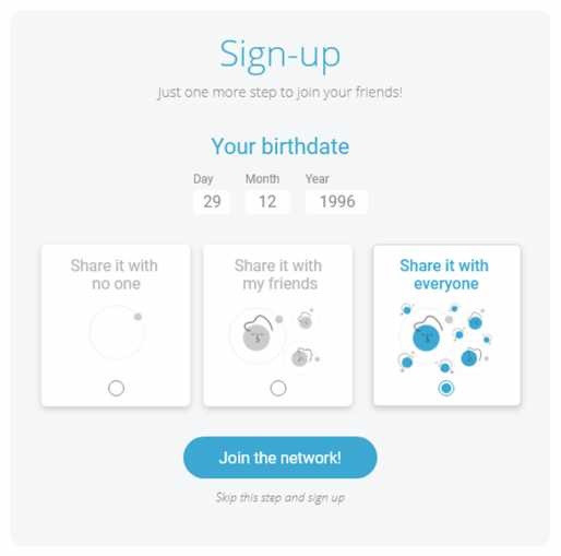
The purpose of the user interface design here is to distract users from privacy issues. This type of dark pattern includes already selected processing purposes or the distraction by further actions or information.

Source: Guidelines 3/2022 on Dark patterns in social media platform interfaces: How to recognise and avoid them, p. 20
Stirring
Stirring is intended to influence users through emotions or visual elements. To do this, information about the processing purpose is presented in an overly positive way, which distorts reality and makes consent more likely. Contrarily, users can also be frightened to achieve the desired result. Finally, there is the possibility of making choices more visually salient.

Source: Guidelines 3/2022 on Dark patterns in social media platform interfaces: How to recognise and avoid them, p. 44
Hindering
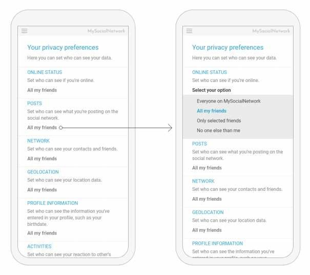
Here, providers want to discourage users from getting information or managing their data. This is attempted through broken links, a lengthy and complicated process, or misleading information.
Fickle
Vendors using this practice design their user interface or interface to be incomprehensible and impractical. This makes it harder to find and use control options. To achieve this, information is repeatedly presented in different ways, which is meant to create confusion, or placed right away on a completely incoherent page.
Left in the dark
To keep users in the dark, information is hidden or presented in such a way that it is unclear how data is processed and how consent is given. To do this, operators use non-official languages, contradictory or vaguely worded information.

Source: Guidelines 3/2022 on Dark patterns in social media platform interfaces: How to recognise and avoid them, p. 24
Legal framework so far
Although the GDPR does not include specific regulations regarding dark patterns, it does specify what consent, and thus indirectly what an online interface, should look like. For example, consent must be given in a lawful and transparent manner, for specified, clear, and legitimate purposes, and must be adequate for the purpose in question. Lawful consent further means that the data subject must give consent on a voluntary and informed basis and as an unambiguous expression of will. Finally, consent must be written in understandable and easily accessible language and must be capable of being revoked at any time as easily as it was given. All of the practices described in this blog post are thus clearly in conflict with the GDPR.
A bird, a plane, no: the Digital Services Act
The Digital Services Act explicitly takes on Dark Patterns for the first time. Together with the Digital Markets Act, the purpose of the Digital Services Act is to protect the fundamental rights of EU citizens in the digital space and to ensure a level playing field for businesses. The DSA came into force on November 16, 2022.
According to the regulation, online platforms should not be allowed to deceive users through the structure, design or function of an online interface. This includes, among other things, design patterns that favor the provider of an online platform at the expense of users by misleading them. These design patterns include, among others, selection options that are made more prominent by means of visual, acoustic or other elements and thus influence decision-making behavior.
Other manipulative practices include repeated requests to make choices again after they have been made or a more difficult process for canceling a service. However, the Digital Services Act also emphasizes that dark pattern prevention provisions are in no way intended to prevent lawful provider-user contact practices.
If any of the DSA's obligations are violated, which amounts to the use of dark patterns, a penalty of 6% of the relevant intermediary service provider's annual worldwide revenue in the preceding fiscal year will be imposed. If, for example, incomplete or misleading information is provided to the authorities or there is a failure to respond, then a penalty of 1% of the global annual revenue of the relevant intermediary service provider or person in the previous fiscal year will be incurred.
No, yes, ohh!
Manipulative cookie or consent banners are just one example of many for dark patterns, but they are coming into focus again and again due to the EU's data protection efforts. This was also the case last month, when the report of a specially established Cookie Banner Taskforce was published. This report shows, however, that there is not unanimity everywhere, which makes it difficult to combat manipulative practices on the Internet in a uniform manner. For example, a large majority of authorities see the lack of a "reject all" option on a cookie banner as a violation of the requirements, with a small minority disagreeing. In the case of a deceptive button design, such as a different color design, the task force again agreed not to make general judgments and therefore only to make statements for individual cases. However, those cases were generally declared invalid in which the contrast between text and button of a banner is so minimal that it renders text illegible.
Let there be light
For those who want to prevent Dark Patterns on their Consent banners, to conclude this blog post, you are invited to follow the principles of Coach Consent. The latter has presented his 7 steps to best practice consent success in his "guest post":
1. Get an overview of the data you process.
2. Give your users a real choice.
3. Determine the purposes for which the data will be processed
4. provide sufficient information about the purposes for which the data will be used
5. enable a clear affirmative action
6. pay attention to your obligation to provide evidence
7. Allow for the possibility of revocation
You can find Coach Consent's blog post and thus the exact explanation of his 7 steps here.
Contact
Partner & Sales Manager: Alexander Jürgens
E-Mail: office@apocrat.at
Mobile: +43 676 4025255

